TEXT BY GEOFF VIVIAN
ALL IMAGES ARE (c) JUDY ROGERS
This is a catalogue essay for the Judy Rogers’ exhibition STILL at the Melody Smith Gallery, Perth 2-24 August 2013.
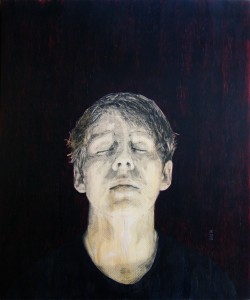
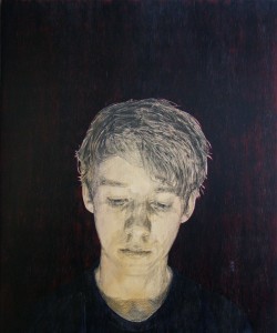
In an era of cheap photography where images proliferate, Judy Rogers draws attention to what is easily overlooked – like the moment when her son, after several hours hunched over a video game, stretches his neck and rests his eyes.
Rogers is an unconventional artist. Not having studied in Australia, she owes very little to the training and ideas apparent in most local art. She uses unusual materials and techniques to make her point, and I would like to draw attention to three of these.
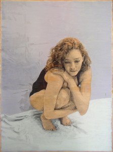
The images themselves partake of photorealism. From a distance, the flesh tones look very much like photographs.
From a closer range we can see they are naked pine, the modelling of the hands and feet consisting of skillfully hatched and cross-hatched pencil lines. Cross hatching was still common in the Nineteenth Century, when middle-class people commonly collected etchings, but has rarely been seen in Australia since Norman Lindsay’s time.
Her flat-colour backgrounds are acrylic paint, with which she carefully delineates the outlines of her figures. In previous shows she left the edges of the picture plane blurry and unfinished.
“My work is really driven by tradition,” she says. “But I am using board as a sort of modern outlook on it so the whole paint effect on it looks like a little bit of a graffiti-type thing. You know, edges open and you can see the material which is a hardware store material anyway and I use a lot of hardware store paint to keep this sort of contemporary edge.”
In this exhibition we can see how she has developed that style. In 2011 her colour range was restricted to pale blue backgrounds and plywood flesh tones with highlights of white. In 2012 she started to use a flat red and black.
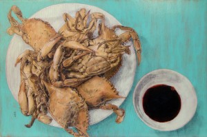
This year, some of her work includes orange, dark red and even green. In the painting Boys we see the cross-hatching has spread from the figures (in this case, cooked crabs) on to the plate and the green picture plain itself. It is no longer an unfinished, ‘graffiti’-type background – it bleeds to the edge of the paintings, like a picture in a glossy Euro-colour magazine.
Her work draws heavily on Renaissance portraiture and the modelling techniques of graphic artists such as Durer. Her admirers have remarked on her ability to find beauty, even drama in the commonplace. She makes no apology for her ability to please, but she never falls into the trap of becoming mawkish, sentimental or twee.
“My work is mainly about happiness and domestic bliss,” she says.
